This article may include affiliate links. We may earn a commission from purchases, at no extra cost to you. Read our disclosure.
A familiar object can supply a starting palette for a small art activity without becoming the subject of a detailed copy. Look for a few colours that relate to one another, then choose suitable existing materials that let you explore that relationship. A patterned cup, a scarf or another ordinary object can provide enough. The useful decision is which colours you want to work with, not whether you can reproduce the object exactly.
Choose a view with a clear colour relationship
Use an object you can observe appropriately without moving it into an unsuitable position. Look at the whole before selecting individual colours. Notice the broad background, the most visible mark and a smaller detail that changes the group. These roles can be more useful than an exhaustive list of every shade.
Keep the object's identity and history out of the exercise unless you have a reason to include them. The palette can begin with what is visible today. You do not need to know a maker's intention to notice that two colours appear together.
Choose a small working group
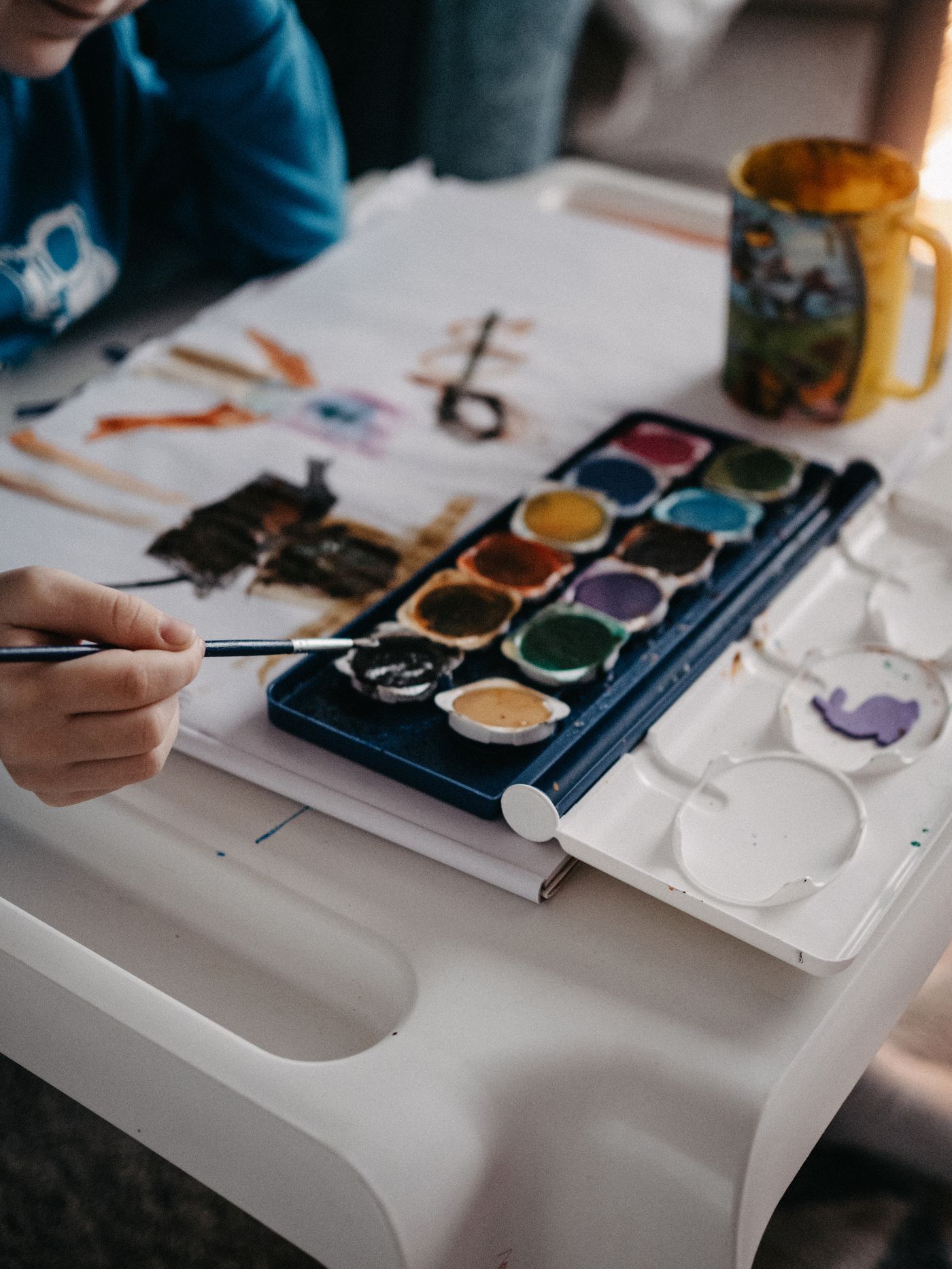
Select familiar materials appropriate to the activity and follow their own use and care instructions. Look for a manageable relationship among the colours you already have rather than purchasing every apparent match. Keep actual product names or references connected to the items instead of relying only on how a label looks.
The small hobby starter-box guide helps keep a new idea within a modest setup. A palette decision can be completed with existing supplies even when the available colours differ from the object in front of you.
Give each colour a role on the page
Try a small arrangement in which one colour occupies a broader area, another makes a repeated mark and a quieter one appears briefly. Then compare what happens if the roles change. You are choosing through the visible result, not applying a universal formula for how much of each colour an image should contain.
Use a suitable surface and keep the method within what you understand about the materials. This article does not provide mixing, drying or technical product instructions. Resolve those questions through appropriate reliable guidance rather than improvising to obtain a closer match.
Notice the relationship you prefer
Look at the page from a comfortable reading distance. Which area draws attention? Does a small contrast remain visible, or has it disappeared into a similar tone? Write a plain observation that would help you continue later without rating the page as a finished artwork.
The hobby practice-note guide keeps that record focused on the next useful session. Identify the actual materials and one decision you want to retain, leaving the rest open.
Put the object back appropriately and return the supplies through their own care arrangement. You can use the palette for another small exercise, keep the page as a reference or leave the activity there. A familiar object has served as a starting point when it made a colour choice more concrete while leaving you free to make something different from it.